Hi Bloggers.
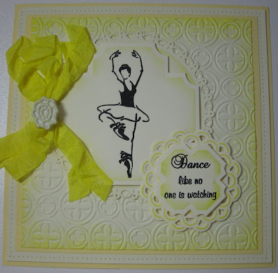
Another Spellbinders card today. I cannot remember whether I demoed this on the Pick of the Week or not - going senile. However, if I had I would have left the bow as natural Chalk White American Seam Binding rather than dying it with the Squeezed Lemonade Distress Ink from the Spring set. It seems a little too bright dyed.
The background is Venetian M-Bossabilities edged with the Squeezed Lemonade. I stamped the image from the Creative Expressions At the Ballet Stamp Set using Jet Black Archival and embossed with Cosmic Shimmer Clear Embossing Powder. I cut it out using Spellbinders Labels Twenty-Seven and inked through the die with Squeezed Lemonade. I cut a Grand Decorative Circles and again inked through the die with Squeezed Lemonade.
I stamped the sentiment from the same stamp set with the Jet Black Archival and embossed with the clear powder. I cut it out with a smaller Labels Twenty-Seven but this time I rotated the die which gives a totally different look. I popped this on to an Asian Accents circle.
I dyed some American Seam Binding in Chalk White with the Squeezed Lemonade. I scrunched it up a bit while I dried it and then tied a messy bow. I added some ink to a Studio 490 Embellish Your Art piece and popped that in the middle.
I finished the card off by piercing around the edges with my Tim Holtz Ruler.
Thanks for stopping by.
Julia.


Hi Julia, lovely card, colours a bit vibrant but you can change it to whatevere you like. I just love seeing all the cards as it gives me food for thought as sometimes my head is empty when I want to made a card.
ReplyDeleteWilma
Stunning card the folder is on my wish list , Melanie
ReplyDeleteMorning Julia, Another beautiful card, I think I would have used a white ribbon rather than the dyed one, it seems far too bright with the squeezed lemonade, but a gorgeous card. I love how you have turned the dies to give a different look. I love the venetian mbossabilities folder, I have ordered that one, can't wait for it to arrive. I agree with Wilma (1st comment), my head is sometimes empty when making a card, and with all the lovely cards in the Blogs, we can pick out various aspects of them and use in our own cards, thank you for posting your beautiful cards. Lots of love from Patricia xx
ReplyDeleteMorning Julia, a lovely card but agree the bow over powers it so white would perhaps have been better but who am I to criticise! Keep the inspiration coming, I need it! Have a lovely Sunday, love Christine H xx
ReplyDeleteHi Julia love this card it fab thanks Jayne
ReplyDeleteA really lovely card Julia but I do agree about the bow
ReplyDeletexx Sandra
Another lovely card Julia. I agree about the bow.
ReplyDeleteCarolyn B x
Morning Julia,
ReplyDeleteI think this i a bright and cheerful card not matching the dull summer that most of us have experienced. Love it.
Have a good day.
Lydia
X
Hi Julia, a lovely card, the bow is a bit bright, perhaps it would have been possible to lighten it a bit. Think these stamps are great. Bx
ReplyDeleteGood Morning Julia, i hope you are enjoying the weekend.
ReplyDeleteWOW this is a stunning card, i do agree with you again with the ribbon, but the rest of it is gorgeous, love the layout and the lemonade colour. These are lovely stamps.
By the way - i tried your tips for stamping, ive cut alot closer to the images and it worked - no more lines around the edge. So THANK YOU SO MUCH.
Emma
Lovely card Julia im warming to the new vibrant colours and they are now on my wish list, hopefully ill get them before they sell out as they are limited editions. love the ballerina stamp used in this too at first i wasn't took keen on them but they have grown on me and i may even purchase them too xx hazel
ReplyDeleteHi julia I love this card its so vibrant and colourful I wouldn't use a white bow as i think it would get losr in the background maybe water the yellow down a bit!! Love lesley xx
ReplyDeleteLove this Julia. xx
ReplyDeleteHi Julia - I bought these stamps after I had seen your demo with them. They are sooo beautiful. I love the layout of your card even though I agree that a white ribbon would be lost, I do think the ribbon is far too bright. Think I would have watered it down a little - like Lesley says. Still a beautiful design though.
ReplyDeleteHugs Sue P xx
Hi Julia
ReplyDeleteLove the colour its so zingy, maybe the ribbon could have used a little less colour but white would have got lost on the card
Now what tips did I miss about stamping???
Sue xx
Hi Julia, these stamps are so lovely, your card is just so fresh and zesty, just right for someone young and vebrant.
ReplyDelete